You probably have an online store and don’t understand why you’re not selling as much as you expected. Your products look great, and they’re priced right! What’s going on? Well, are you sure you’ve created a good online store?
Let’s go over a few characteristics that every basic online shop must have to be successful. And when you’re done with this post, take note of the ones you’re not already working on and go ahead and implement them! Because we’ll even tell you how to configure them if you’re using PrestaShop.
Table of contents
Functionality of your online store
Nobody likes what doesn’t work. And when we talk about the functionality of an online store like PrestaShop, we’re talking about those features that will make it easy for the user to understand how it works, what it offers, how to find it, and so on.
An easy navigation is one of the most important points. Make navigation simple. Avoid the user having to go through more than three different pages in your online store to enter a product in the cart. The simpler the process, the more likely it will be that the purchase is completed.
Optimally organize and create categories
Catalog structuring is important and usually involves the creation of categories and subcategories. Think about the structure of your shop, but also about the possible additions you could make to it in the future. This way you won’t need to completely reorganize your catalog every time you expand your business.
One of PrestaShop’s features is that you can organize and change the menu tree very easily. You just select the option of where you want that particular category or subcategory to show, and that’s it.
TIP: From PrestaShop 1.7 you have to follow the path Catalog > Categories > View or Modify category > select where you want to place that product or new subcategory:
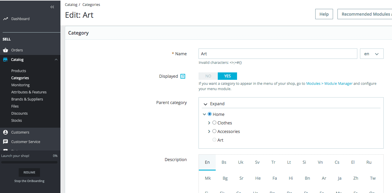
That said, if the URL showed the path shopname.com/category1/product and now you have moved the product to category 2, the new URL will be shopname.com/category2/product, so you’re going to have to do a 301 redirect. Be careful with this.
Multi language online store
This point is also important if you’re going to sell outside your country. Nowadays any CMS or e-commerce content manager incorporates this functionality, but it’s important that you’re clear from the beginning if this is something you’re going to do.
We want to emphasize this part because if you configure the store for a single language, and then decide you want to sell in Spain or want to incorporate another language, you’ll have to reconfigure the language option, make redirections, etc.
So if multilanguage is going to be a feature of your online store, leave the option configured so that your store appears as storename.com/es and later it can also be storename.com/es (for Spanish), etc.
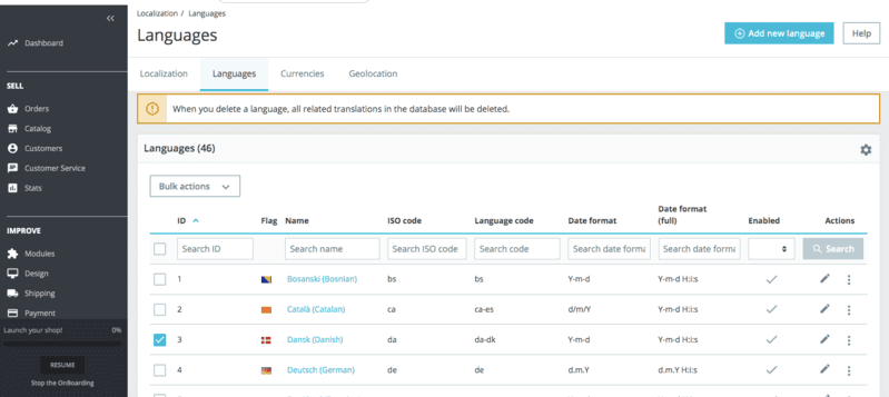
TIP: In PrestaShop 1.7 you must follow the Customize > International > Localization path and leave the languages you want to have in your online store checked.
Localizer of the physical store
This point is not very important for many users, as they’re mainly visiting your PrestaShop store because they want to buy online. Or maybe you don’t even have a physical store.
But if you do, despite the above, it’s fine for you to indicate it in your online store, in case someone prefers to visit you in person. Especially for certain types of products that users are reluctant to buy online, such as for example jewelry or certain kind of clothes.
User Experience
The user experience includes not only what happens on your website, but also the memory and impression that users keep once they’re out of it. But that’s more of a marketing strategy. So in this article, we’re going to focus more on the on-site experience.
The speed of your online store
Another key point is that your PrestaShop store shouldn’t take too long to load. And although it’s a very important factor in SEO, we also wanted to include it here because really, the user will be the first to notice if the page is slow or fast.
And it goes without saying that if it’s slow, there’s a good chance that they’ll leave. Therefore, it might be possible that you just lost sale.
Work on the presentation of the products
Always keep in mind that since the user doesn’t have the product in front of them, the more you show them and with more detail, the better. So add several quality pictures of the products – different perspectives, if possible – and offer a detailed description of their features.
You’ll help the user know which of the options is best suited to their needs and avoid misunderstandings that can also lead to returns.
Show opinions and testimonials
It has been proven that word of mouth works very well, both offline and online. A person is much more likely to buy a product if there’s someone speaking well of it.
This is why we believe that the reviews section, whether general or specific reviews on each product page, are a very important feature of any online store, PrestaShop or not. Don’t neglect it and encourage your customers to leave reviews on the different items they’ve bought, because it always helps!
Offer promotions
Promotions are always a good hook, although they shouldn’t be the only value proposition you offer, or else they’ll only think of you when they want something cheap. Which is fine if you’re an outlet. But otherwise, it should be used as a way to build loyalty, but not to attract customers.
Since PrestaShop is a platform that has the ability to add modules for all sorts of functions and features, you can search for one that displays promotions. Or even in your own products, if you don’t apply them massively, you can manually indicate when a product or some products have a discount.
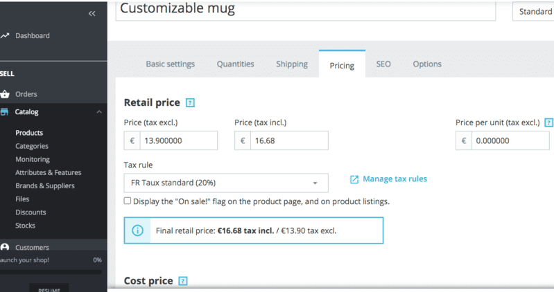
TIP: In PrestaShop 1.7 you must follow the path Catalog > Products > Pricing tab > Specific prices and fill in the % discount or the amount in euros that will be cheaper than before.
Add general terms and conditions of sale (GCS)
We consider this to be fundamental. Although many people will probably not read them, it’s a point in your favor for the undecided ones, because in the terms of sale you’ll define the “rules” of your online store. Orders, deliveries, payment, returns.
In case of conflict with an order, they GSC will always be your most powerful weapon. But they can also be the key to inspire confidence or show the potential customer that your online store has everything under control and your business is well set up.
Payment methods
It’s always been said that the more payment methods you use, the more likely you are to sell. And this is partly true, but the more time passes, the truth is that methods such as cash on delivery or bank transfer are less and less used. Even so…
Offer more than one payment method
Because the preference for one payment method or another may depend on the type of product or sector. Study your type of customer and your market before making decisions. Nowadays we don’t think it’s so much about having all the payment methods available, but at least the most used ones: credit card or PayPal, mostly.
Clarity in shipping costs
They’re intimately linked to the payment, that’s why we include them here. Because the first thing we do while paying, is to check what are the shipping costs.
A large number of shopping carts are abandoned when, at the end of the process, the user discovers that the shipping costs of the product are higher than expected. To avoid this, make the shipping rate of the items a predominant feature in your online shop: make the information clear and visible.
Usability of the shop
Although it may seem like it, it’s not exactly the same as functionality. Functionality is a concept more associated with how the user moves through your online store, that has the feeling that everything works well. Usability is more the perception of whether it has been easy or difficult to achieve their goal: to buy, contact you, etc.
Contact and customer service
If you make it easy for the user to contact you in case of doubt, it’ll be more likely that you can solve their reluctance to make a purchase, and finally end up buying your product.

So put the Contact and Customer Service option in a visible and easily accessible place. Your potential customers will thank you for it. You can even explore the option of a chatbot that answers frequently asked questions.
The important thing is that the user doesn’t feel unattended and as if they’re facing a big void when looking for support or contact. That gives a bad impression and obviously, loss of sales. Especially if your product is not an impulse purchase and requires some consideration, either by price or type.
Facilitates the search for products
Many times we think we have the best organization in the world a la Marie Kondo. But even so, for a person who doesn’t know your online store or PrestaShop, the first time they access it can be confusing.
So a very good idea is to include a search box inside your online shop. For example by product name – tank top with embroidery. Or type of item, such as perfumes. The wider the capacity of your search engine, the better.
Enable product comparison
If you have several products similar in features, prices, etc., it’s always advisable to enable a product comparison module. This way, you make it easier for the user to decide between several similar items. And instead of leaving your e.commerce confused because they need to think about it, it’s very likely that by making it easier for them, they end up making the purchase.
Work on the SEO of your online store
The positioning of the e-commerce is a fundamental point. And to get a good position in Google, the features of your store should pay attention to both technical and other factors. Luckily, PrestaShop incorporates SEO-oriented solutions within its platform. Let’s take a look at a few of them.
Friendly URLs in PrestaShop
When we talk about friendly URLs, we mean a URL that we can understand when we read it: nameofthestore.com/red-shirt-with-flowers.html and not a horror like nameofthestore.com/14542-shirt-col-334.html. This doesn’t work for your user or Google. Fix it!
TIP: To solve it, inside the PrestaShop 1.7 platform you can configure it in the path Configure > Store Parameters > Traffic and SEO > scroll to the bottom and there you’ll see the following box:
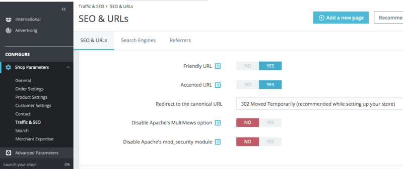
Any other CMS surely also has this option, as it’s very important. All of them usually have a section called SEO or similar, where you can make this kind of adjustments. And it’s also essential that you create the sitemap with these new URLs, which are the ones you want Google to index.
It’s important that you set this parameter before launching your online store. If you do it later, you’ll have to redirect the old URLs to the new ones with a 301. And if you have many of them, it can be a big headache.
Titles and meta descriptions in the backoffice
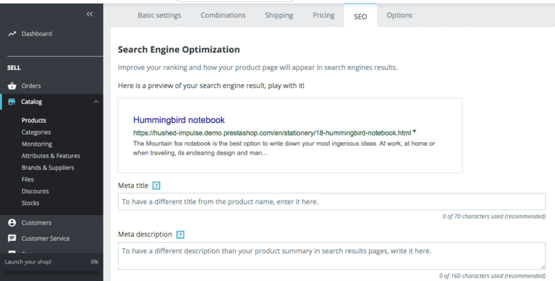
To appear correctly in the search results and attract the attention of potential customers, make clear to them what you offer – in the title – and why they should buy it, what is your advantage, your differentiation – in the meta description. Because this is the first thing they’ll see if they find you through a search engine.
TIP: From the backoffice of your PrestaShop 1.7 store you can do this from Catalog > Products > Select the product you want to optimize > SEO tab:
Mobile responsive online store
Especially since Google said at the end of 2018 that the indexing priority from then on was going to be the mobile version. This, however, depends not so much on PrestaShop itself, but on the template you choose for your store.
Optimized WPO
Earlier we talked about loading speed from the user’s point of view, but now we’re talking about it from the SEO point of view. For Google, WPO or Web Performance Optimization means that it takes no more than 1.5 seconds for your website to load. And it takes into account the scripts that may prevent the correct loading, the size of the images, the calls to the server…
Conclusion
The features to have a good PrestaShop store – or any other online store – as you can see, are many and varied. You have to pay attention not only to what the customer sees, but also to how it works, how easy it is to use, if the store is easy to be found… In other words, you have to optimize your PrestaShop.
It’s a lot of work, but this is logical. A business has never been a simple task. Just because you can now “easily” make a shop on the Internet, it doesn’t mean that you don’t have to invest time and money to make it really work.
So, does your online store have all the features you need to sell more and better? Any doubt or contribution, we read you in the comments.



Leave a comment