Table of contents
OUR HOMEPAGE
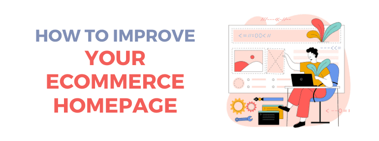
The homepage of any website tells the customer everything they need to know, and it’s even more important if it’s an ecommerce, because you’re trying to sell them something. Even if we have a good SEO and our customers get directly to category and product pages, they will probably go to the homepage to check what kind of online store it is before buying anything. That’s why the homepage is our business card and our main showcase all in one.
Let’s take a look at the things we need to keep in mind when developing (or improving) our homepage:
Design
An attractive design is one of the first aspects to consider if you want to be successful with your ecommerce. That instant when shoppers land on your store, may be the only chance you have that a potential customer translates into a purchase. Therefore, you must make a strong positive impression or you will certainly miss the opportunity to gain a customer. And to find out how to do that, or get inspired to improve what you already have, it’s best to “research” your competition and top ecommerces (both in your industry and beyond).
Basic content
It’s clear that all businesses have their own particularities, either by location, by sector, by type of customers… and so it’s logical to think that not all should contain the same elements on your homepage, because each one will have its own needs. But it is equally logical to think that there are certain things common to all online stores that, one way or another, must be included on your homepage like the contact information or other elements of trust of the brand. Remember that buyers want to know that they’re visiting a real store, that they can trust it. And therefore, it’s necessary to include data such as address, phone number, shipping and return policies, links to social networks, etc.
Promotional content
It is convenient that the homepage of your ecommerce captures the attention of potential customers through a daily offer or a very popular product that will be the first thing they look at as soon as they access the site. It’s also a good idea to give it a more attractive visual touch by using evocative and high resolution images for the products. And of course, it’s fundamental to offer different payment methods to make the whole purchasing process more comfortable.
And, above all, the most important tip: Make your homepage dynamic. It shouldn’t always be the same, because apart from the fact that search engines will penalize you for static content, your users will end up bored and not coming back, seeing that you have no changes (it gives a feeling of abandonment). Especially when it comes to offers and promotions.
Need more tips? Surf our blog, where we discuss many more topics, or, if you prefer it, contact us directly and ask us any questions you might have.
Related Posts


Deja un comentario